Etude de cas
Homepage Redesign
Homepage clarity turned more treatment interest into consultation requests.
The homepage was restructured around premium positioning, clearer treatment paths, and a tighter mobile CTA flow so visitors reached the consultation step faster.
+27%
consult requests
10 business days / PiQweb sprint analysis
-31%
mobile drop-off
10 business days / PiQweb sprint analysis
12 days
delivery window
10 business days / PiQweb sprint analysis
Snapshot client
Med spa
Existing site with conversion friction
Type de client
Med spa
Source de trafic
Website traffic
Objectif conversion
More qualified consultation requests
Delai
10 business days
La fuite
Le point precis ou l'intention se perdait
The clinic looked premium offline, but the website buried its main offer, scattered social proof, and made the next step feel vague on mobile.
Fuites conversion
- Weak hierarchy between the hero, services, and consultation CTA
- Too much proof content without a clear trust sequence
- Mobile sections that felt long before the next action appeared
- Premium positioning that did not come through strongly enough in the copy
Manques de confiance
- Too much proof content without a clear trust sequence
- Mobile sections that felt long before the next action appeared
Friction mobile
- Mobile sections that felt long before the next action appeared
Tracking / technique
- Premium positioning that did not come through strongly enough in the copy
- No clear flow from curiosity to consultation request
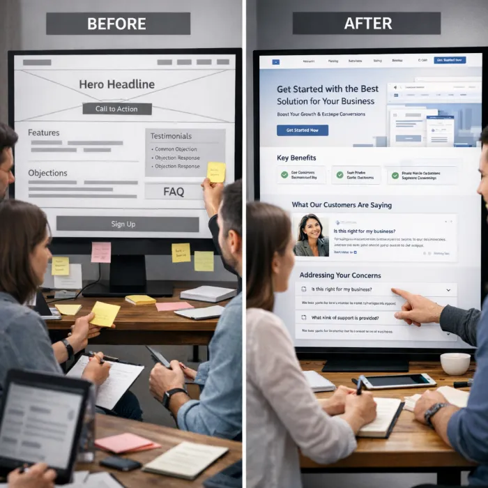
Avant
Before-state visual used to frame the conversion leak.
Apres
After-state visual used to show the conversion structure direction.
Travail realise
Ce qui a change, et pourquoi cela a fonctionne
The sprint focused on making the homepage behave like a sales path instead of a brochure. The work was structured around clarity, trust, and next-step momentum.
01
Offer and headline realignment
Probleme
Weak hierarchy between the hero, services, and consultation CTA
Action
We reframed the headline and supporting copy around the treatments, outcomes, and premium positioning that mattered most to first-time visitors.
Pourquoi
The change worked because it removed a decision obstacle before the visitor reached the consultation action.
Impact
More visitors reached the consultation CTA from the homepage
02
CTA path cleanup
Probleme
Too much proof content without a clear trust sequence
Action
Primary and secondary actions were simplified so the consultation path stayed visible from the hero through the core trust sections.
Pourquoi
The change worked because it removed a decision obstacle before the visitor reached the consultation action.
Impact
Mobile drop-off decreased across the main decision sections
03
Trust sequencing on mobile
Probleme
Mobile sections that felt long before the next action appeared
Action
Reviews, before-and-after proof, and reassurance sections were rearranged so confidence built before friction appeared.
Pourquoi
The change worked because it removed a decision obstacle before the visitor reached the consultation action.
Impact
The clinic’s premium positioning felt more credible and more immediate
04
Homepage structure refinement
Probleme
Premium positioning that did not come through strongly enough in the copy
Action
The page was shortened, sections were clarified, and visual hierarchy was adjusted so the homepage felt faster to scan and easier to act on.
Pourquoi
The change worked because it removed a decision obstacle before the visitor reached the consultation action.
Impact
Proof content supported the consultation decision instead of distracting from it
Resultats
After the rewrite and structure cleanup, the homepage produced a clearer path from initial interest to consultation intent.
+27%
consult requests
10 business days / PiQweb sprint analysis
-31%
mobile drop-off
10 business days / PiQweb sprint analysis
12 days
delivery window
10 business days / PiQweb sprint analysis
Details des resultats
- More visitors reached the consultation CTA from the homepage
- Mobile drop-off decreased across the main decision sections
- The clinic’s premium positioning felt more credible and more immediate
- Proof content supported the consultation decision instead of distracting from it
- The site became easier for the team to build future pages on top of
"The site finally feels aligned with how we sell consultations in person. The booking path is much clearer."
Clinic Director
Luxury Aesthetics Clinic
A retenir
Ce que ce cas revele pour un autre site med spa
A premium med spa homepage needs more than good design. It needs a visible conversion path, clear offer framing, and trust content that appears in the right order, especially on mobile.
With the homepage now structured properly, the clinic can extend the same conversion logic into service pages, booking flows, and local SEO landing pages without rebuilding the strategy from scratch.
Find the hesitation point, place proof near it, and make the next step obvious.
Prochaine etape
Want us to find the same leaks on your site?
Request a 3-point audit and we will identify the highest-impact homepage, service-page, or mobile booking issues before recommending a sprint.
If we do not find 3 clear conversion fixes, we will tell you not to hire us.