Etude de cas
Service Page Rewrite
Trust assets were moved into the exact moments where visitors hesitated.
The service page was rebuilt around outcomes, proof, and objection handling so treatment interest converted into form clicks instead of page exits.
+19%
CTA clicks
10 business days / PiQweb sprint analysis
+11%
time on page
10 business days / PiQweb sprint analysis
-22%
early exits
10 business days / PiQweb sprint analysis
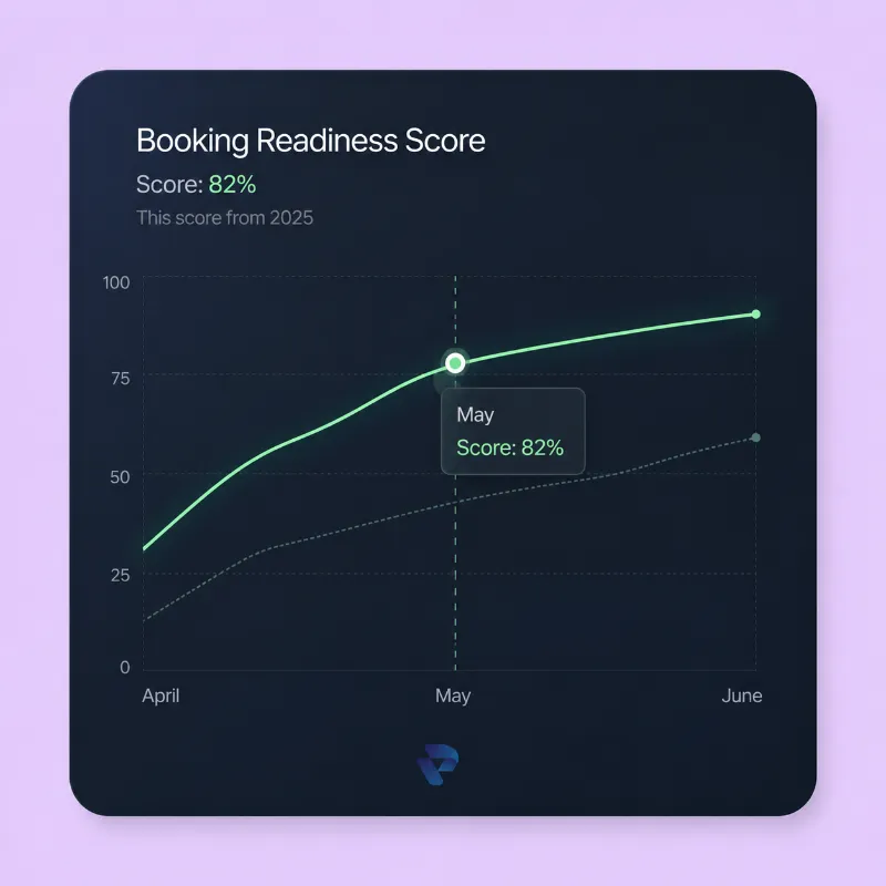
Snapshot client
Med spa
Existing site with conversion friction
Type de client
Med spa
Source de trafic
Website traffic
Objectif conversion
More qualified consultation requests
Delai
10 business days
La fuite
Le point precis ou l'intention se perdait
The page described the treatment, but did not build enough confidence before asking the visitor to act. Reviews, FAQs, and before-and-after proof were too disconnected.
Fuites conversion
- Reviews and before-and-after proof appeared too late
- The treatment explanation lacked strong outcome framing
- CTAs were present, but not positioned around the highest-intent moments
- The page answered questions, but not in the order patients usually ask them
Manques de confiance
- Reviews and before-and-after proof appeared too late
- The form felt disconnected from the proof that should support it
Friction mobile
- Reviews and before-and-after proof appeared too late
- The treatment explanation lacked strong outcome framing
Tracking / technique
- The form felt disconnected from the proof that should support it
Avant
Before-state visual used to frame the conversion leak.
Apres
After-state visual used to show the conversion structure direction.
Travail realise
Ce qui a change, et pourquoi cela a fonctionne
The page was rebuilt as a trust-first consultation page, with content blocks arranged around confidence building instead of generic page structure.
01
Outcome-driven page rewrite
Probleme
Reviews and before-and-after proof appeared too late
Action
We rewrote the treatment framing so visitors quickly understood who the service was for, what result to expect, and why the clinic was credible.
Pourquoi
The change worked because it removed a decision obstacle before the visitor reached the consultation action.
Impact
More visitors clicked through to the inquiry form
02
Proof repositioning
Probleme
The treatment explanation lacked strong outcome framing
Action
Before-and-after examples, reviews, and FAQs were placed next to the areas where visitors were most likely to hesitate.
Pourquoi
The change worked because it removed a decision obstacle before the visitor reached the consultation action.
Impact
Early page exits dropped as the content became easier to trust
03
CTA timing refinement
Probleme
CTAs were present, but not positioned around the highest-intent moments
Action
Call-to-action blocks were repeated more intentionally so the visitor did not need to hunt for the next step.
Pourquoi
The change worked because it removed a decision obstacle before the visitor reached the consultation action.
Impact
The clinic’s expertise was communicated more clearly before the CTA
04
Scanability and trust cleanup
Probleme
The page answered questions, but not in the order patients usually ask them
Action
The layout was simplified to reduce cognitive load and help patients move from question to confidence more quickly.
Pourquoi
The change worked because it removed a decision obstacle before the visitor reached the consultation action.
Impact
The page became easier to reuse as a template for additional treatment pages
Resultats
The stronger trust sequence improved how visitors moved through the page and increased form intent without adding more complexity.
+19%
CTA clicks
10 business days / PiQweb sprint analysis
+11%
time on page
10 business days / PiQweb sprint analysis
-22%
early exits
10 business days / PiQweb sprint analysis
Details des resultats
- More visitors clicked through to the inquiry form
- Early page exits dropped as the content became easier to trust
- The clinic’s expertise was communicated more clearly before the CTA
- The page became easier to reuse as a template for additional treatment pages
- The consultation path felt more natural to the patient
"The page feels calmer and more convincing. Patients now understand the offer before they reach out."
Practice Manager
Injectables Service Line
A retenir
Ce que ce cas revele pour un autre site med spa
Service pages do not convert because they contain more information. They convert when the right information appears at the right point in the decision path.
This service-page system can now be rolled out to the clinic’s other treatments with a clearer structure for proof, FAQs, and booking intent.
Find the hesitation point, place proof near it, and make the next step obvious.
Prochaine etape
Want us to find the same leaks on your site?
Request a 3-point audit and we will identify the highest-impact homepage, service-page, or mobile booking issues before recommending a sprint.
If we do not find 3 clear conversion fixes, we will tell you not to hire us.